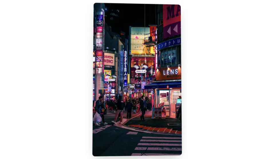
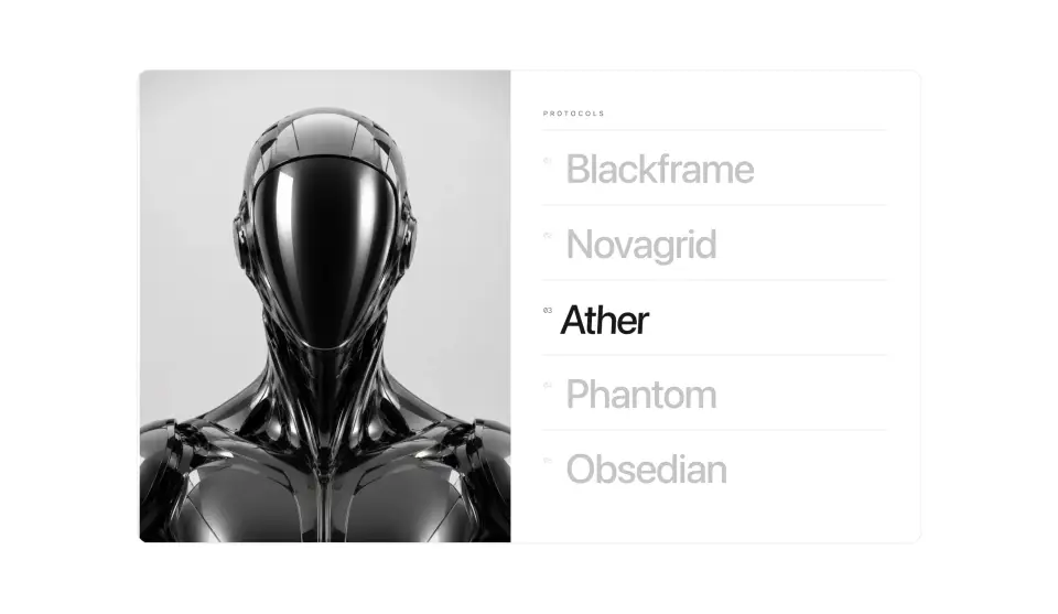
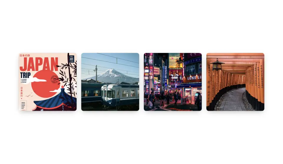
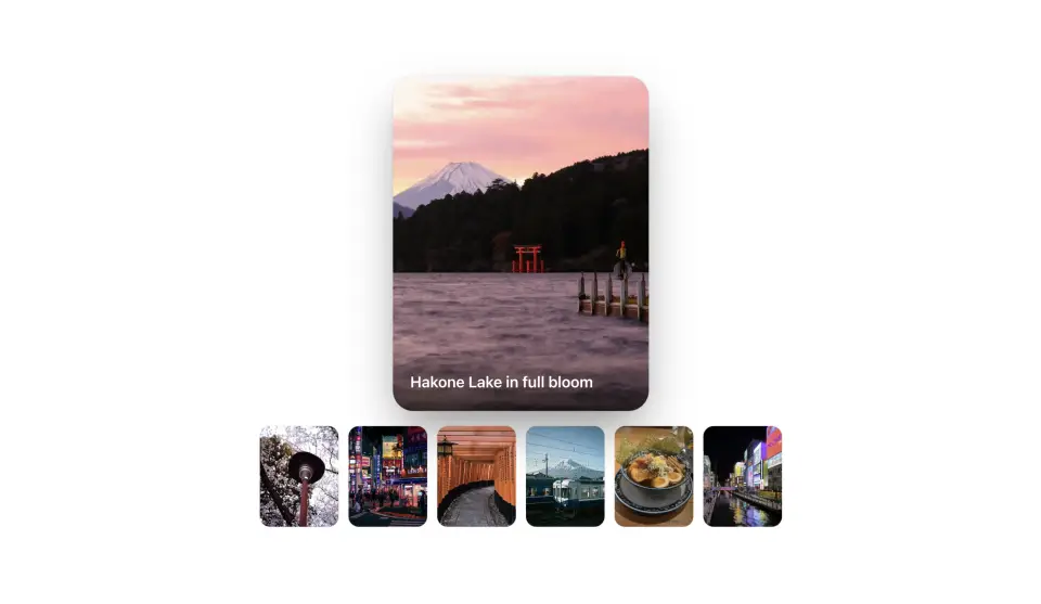
Shutter Gallery
ProInstallation
npx shadcn add @useplanes/shutter-gallery
Works once the @useplanes registry is set up in your project (one-time). After that, copy and run commands directly.
Unlock with Planes Pro
$99 once · 118 Pro components · lifetime updates.
<ShutterGallery
  items={[
    { src: "/cars/1.webp", alt: "Red coupe at night", title: "Night Run", subtitle: "Rear three-quarter" },
    { src: "/cars/2.webp", alt: "Black car in a studio", title: "Obsidian", subtitle: "Studio, single key light" },
  ]}
  height={480}
/>
Examples
Controlled
Drive the open panel from your own state, e.g. to sync it with a list or the URL.
const [open, setOpen] = useState<number | null>(0);

<ShutterGallery items={items} open={open} onOpenChange={setOpen} />
Keyboard and touch
Each panel is a button with aria-expanded. Tab to peek, Enter to open, Escape to close. On touch there is no peek, so the first tap opens.
<ShutterGallery items={items} />Reduced motion
With prefers-reduced-motion panels snap open and closed, and the caption fades without travel or blur.
<ShutterGallery items={items} />Use cases
Product lineup
Models, colorways or editions side by side, each opening into its own hero shot.
Portfolio strip
A row of projects that stays calm until the visitor picks one.
Collection teaser
A drop or lookbook where the shade on each panel builds anticipation.
Case study chapters
Chapters of a story as panels, opened one at a time.