Animated Navbars for React
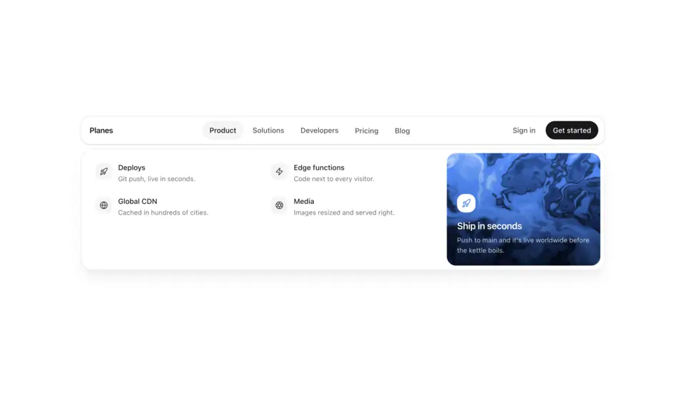
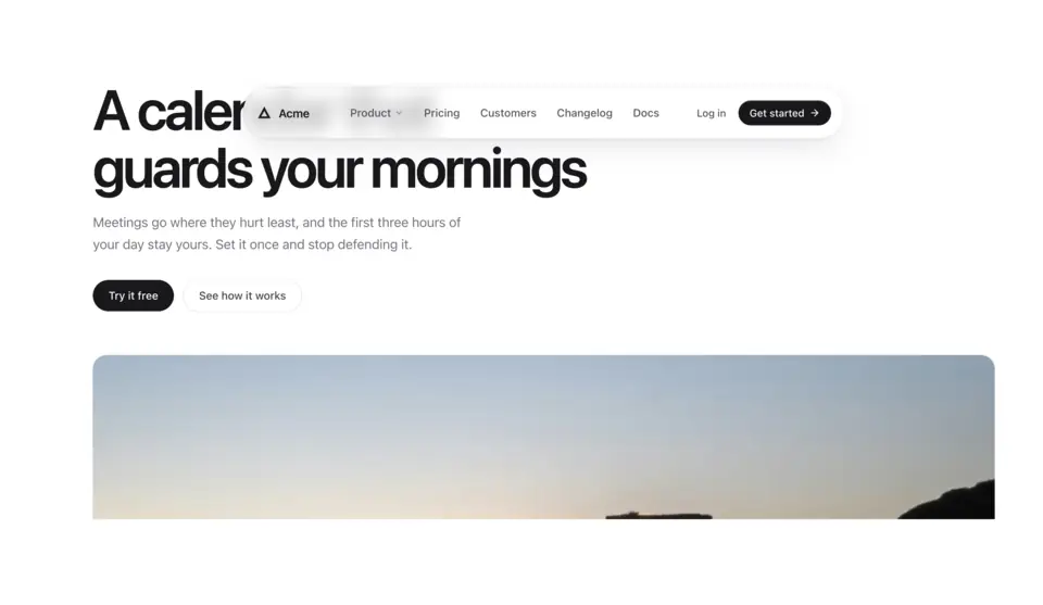
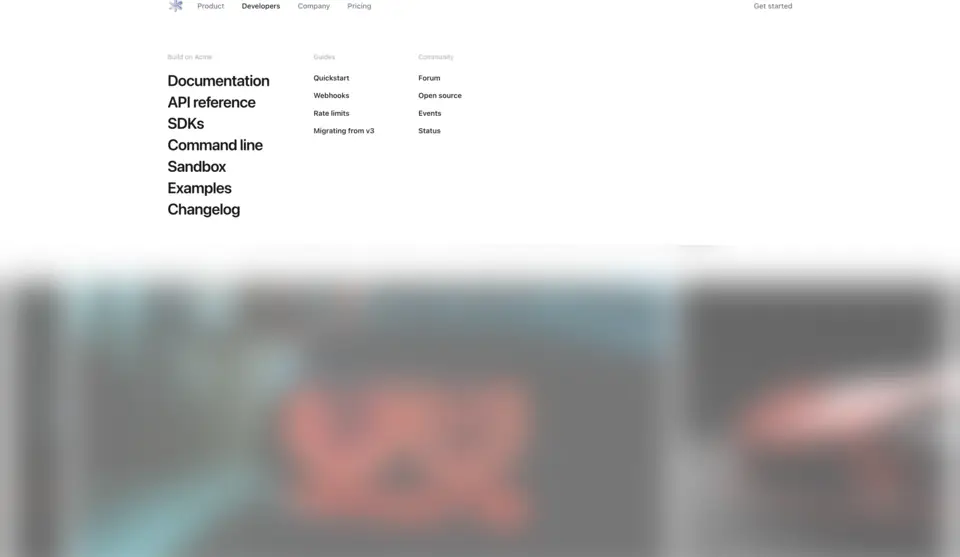
The first thing on the page. A sticky header that settles into a floating pill as you scroll, a mega menu beside a flowing liquid card, and a menu that unrolls like a blind. Links and sections are props, and each one collapses to a mobile menu.
3 components · Browse all components
Components
FAQ
- Do the navbars work on mobile and with the keyboard?
- Yes. Each one collapses to a mobile menu on small screens and handles focus, Escape and keyboard navigation.
- How do I install the components in Navbars?
- With the shadcn CLI. Each component page lists its exact command: free components install from a public URL (npx shadcn add https://useplanes.com/r/<name>.json), Pro components install by name (npx shadcn add @useplanes/<name>) after npx @useplanes/cli init --key <key>.
- Do they work with Next.js App Router and Tailwind CSS v4?
- Yes. Every component is a React 19 client component styled with Tailwind CSS v4, and works in Next.js App Router, Vite, or any React app with Tailwind CSS v4.
- Are the components in Navbars free?
- They are part of Planes Pro, a one-time license that covers every component and future additions. The catalog also has free components in other categories.
- What do they depend on?
- Motion (formerly Framer Motion) is the only runtime animation dependency. The CLI writes the .tsx source into your project, so there is no Planes package to keep updated.