Contact Section Components for React
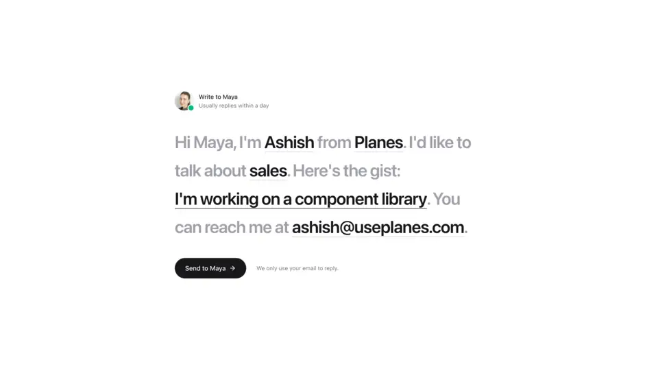
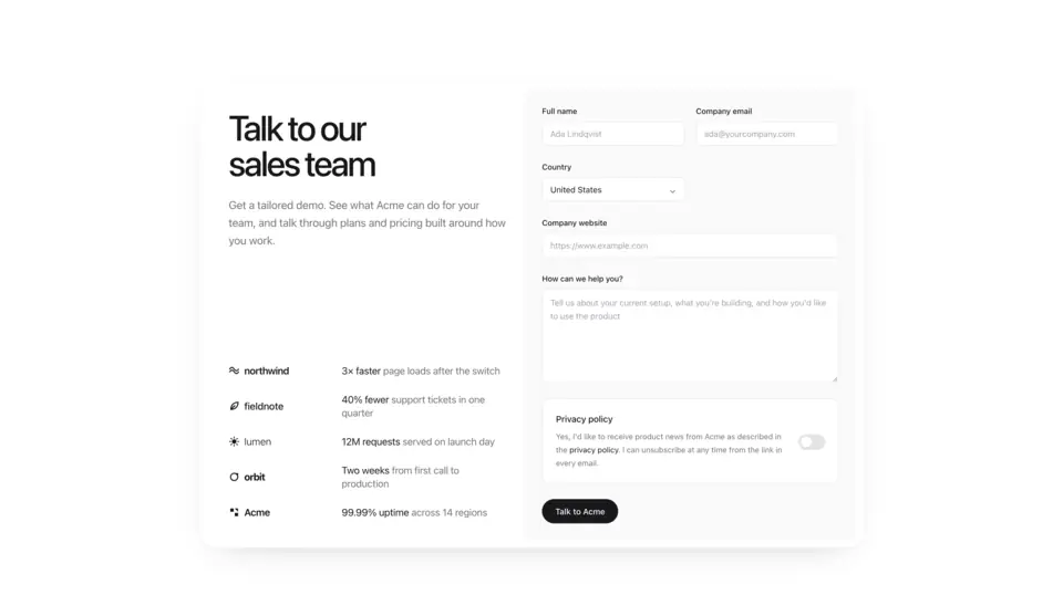
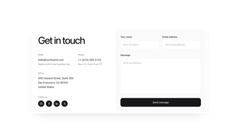
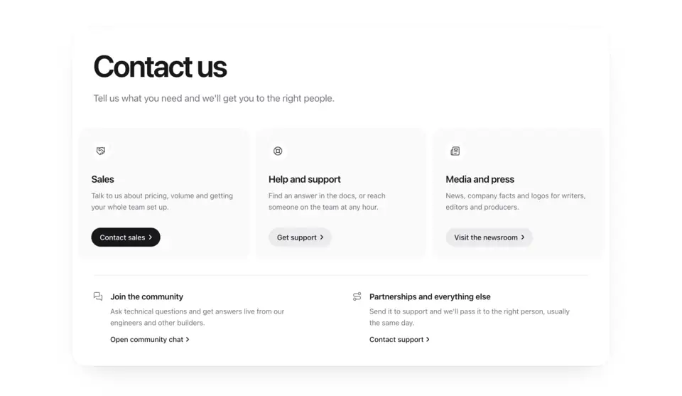
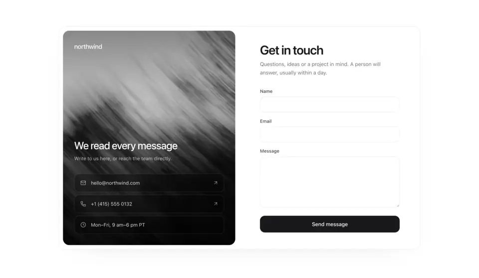
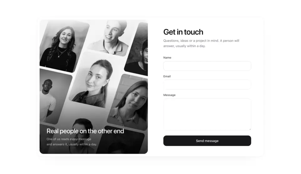
Contact sections for company and product sites. Contact 1 turns the form into a short letter the visitor completes, Contact 2 is a contact sales page with customer results beside a plain form, Contact 3 puts email, phone, address and socials beside a message form, Contact 4 leads with a human promise and a large email address, Contact 5 routes people with cards instead of a form, Contact 6 pairs a photo with a minimal form card, and Contact 7 sets the form beside a tilted 3D wall of team portraits.
7 components · Browse all components
Components
FAQ
- Where do the contact forms send messages?
- Nowhere by default. Each one calls onSubmit with the values, so you post them to your own API route, a form service or your CRM. Contact 3 also waits on a returned promise to show its sending state.
- How do I install the components in Contact?
- With the shadcn CLI. Each component page lists its exact command: free components install from a public URL (npx shadcn add https://useplanes.com/r/<name>.json), Pro components install by name (npx shadcn add @useplanes/<name>) after npx @useplanes/cli init --key <key>.
- Do they work with Next.js App Router and Tailwind CSS v4?
- Yes. Every component is a React 19 client component styled with Tailwind CSS v4, and works in Next.js App Router, Vite, or any React app with Tailwind CSS v4.
- Are the components in Contact free?
- They are part of Planes Pro, a one-time license that covers every component and future additions. The catalog also has free components in other categories.
- What do they depend on?
- Motion (formerly Framer Motion) is the only runtime animation dependency. The CLI writes the .tsx source into your project, so there is no Planes package to keep updated.