Feature Section Components for React
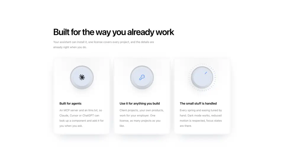
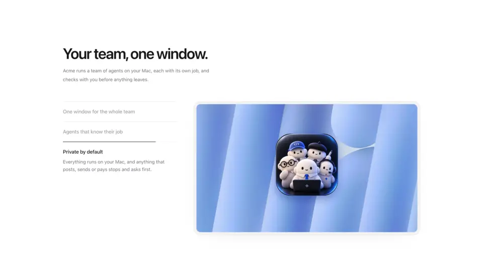
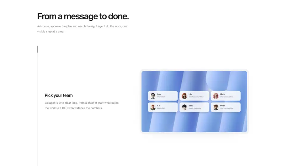
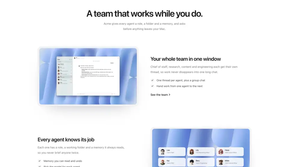
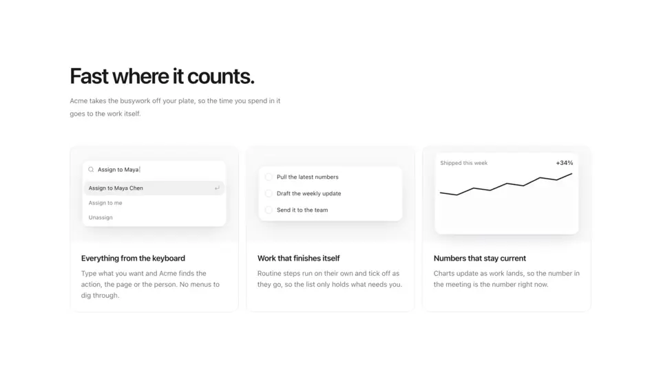
Feature sections for product and landing pages. Feature 1 sets three feature cards in a double-border frame, each with one quiet animated object, Feature 2 is a product tour that swaps a large screenshot as you step through the list, Feature 3 tells a scroll-driven story with the screenshot pinned beside each step, Feature 4 alternates rows whose screenshots straighten in 3D as they arrive, and Feature 5 gives each card a small live demo.
5 components · Browse all components
Components
FAQ
- Can I use my own product screenshots?
- Yes. Every image is a plain src string, so point it at your own screenshots or any CDN. Features 2, 3 and 4 crop from the top at 960:557, so shots at that ratio fit without trimming.
- How do I install the components in Features?
- With the shadcn CLI. Each component page lists its exact command: free components install from a public URL (npx shadcn add https://useplanes.com/r/<name>.json), Pro components install by name (npx shadcn add @useplanes/<name>) after npx @useplanes/cli init --key <key>.
- Do they work with Next.js App Router and Tailwind CSS v4?
- Yes. Every component is a React 19 client component styled with Tailwind CSS v4, and works in Next.js App Router, Vite, or any React app with Tailwind CSS v4.
- Are the components in Features free?
- They are part of Planes Pro, a one-time license that covers every component and future additions. The catalog also has free components in other categories.
- What do they depend on?
- Motion (formerly Framer Motion) is the only runtime animation dependency. The CLI writes the .tsx source into your project, so there is no Planes package to keep updated.