Interactive components for modern interfaces.
A set of beautifully crafted React components and interactions you can customize, extend, and build on.
Beams
ProSaturated ribbons raked across black, broken into grain by a noise mask instead of blurred into haze. They drift on their own and lean with the pointer. Pure CSS, no canvas.
Installation
npx shadcn add @useplanes/beams
Unlock with Planes Pro
$99 once · 80 Pro components · lifetime updates.
<section className="relative h-[560px] bg-black">
  <Beams />
  <h1 className="absolute inset-x-0 top-1/3 text-center text-white">
    Your headline
  </h1>
</section>
Use cases
Hero backdrop
The light stays in a band with black corners and floor, so a headline reads cleanly on top.
Launch page
Printed-light texture without a canvas or a shader, so it ships anywhere CSS does.
Section divider
Short and wide, it makes a break between two dark sections without a hard edge.
Related components
All WebGL components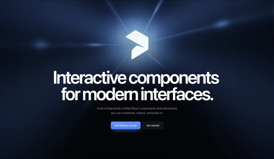
Logo Flare
Turn any logo into a light source. The SVG becomes a distance field lit with a white-hot core, halo, needle flares, and soft petals over film grain.
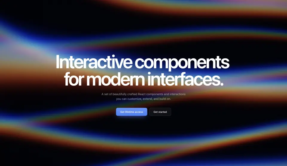
Prism
Light through glass. Soft streaks bend across the frame with true chromatic dispersion: blue on one edge, amber on the other, white in the core.
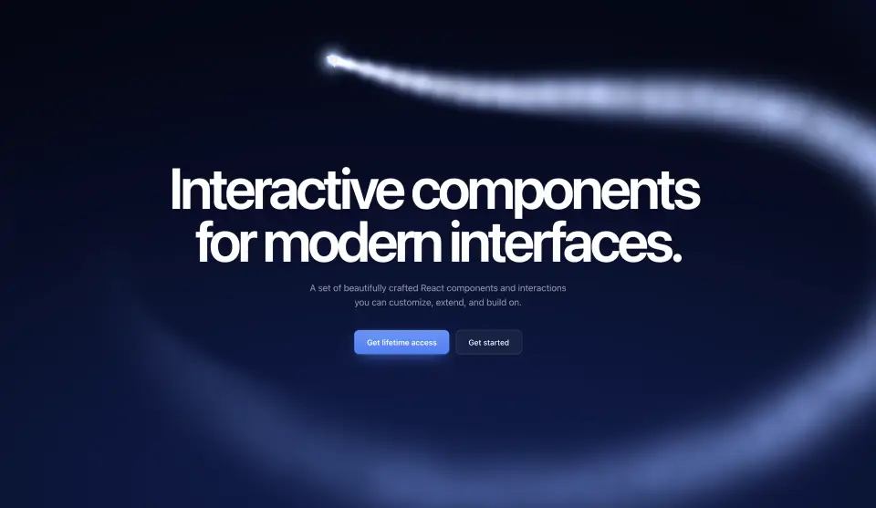
Skywriter
A stunt plane skywrites around your headline. Its smoke hangs in the sky, drifts, puffs up, and dissolves while the next lap is drawn.
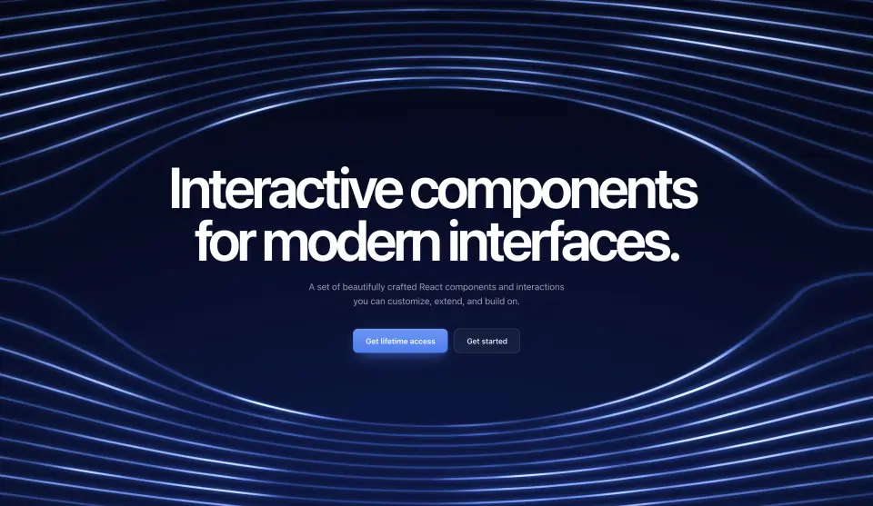
Wind Tunnel
Streamlines of real potential flow bend around an invisible wing where your headline sits, with smoke pulses and a turbulent wake.
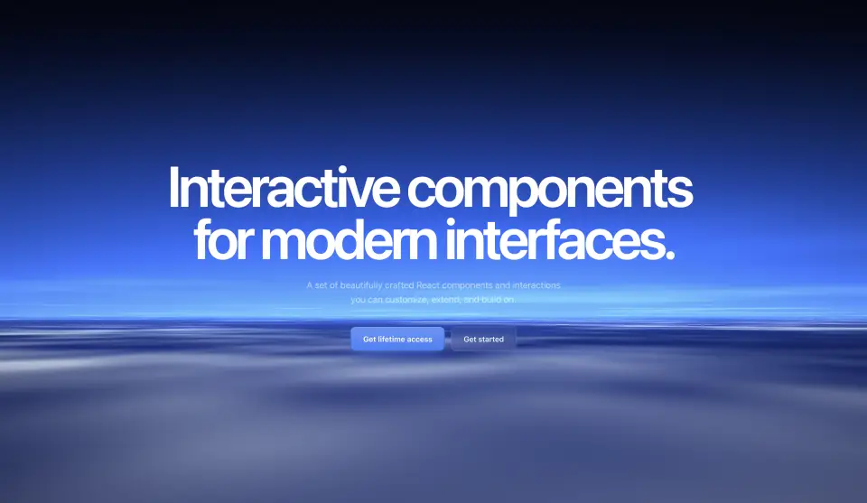
Cloud Sea
The window seat: a cloud deck seen from altitude, drifting forward under a blue-hour sky with cirrus overhead.
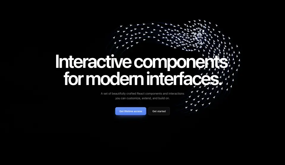
Paper Planes
A flock of paper planes that streams around your headline, chases the pointer, and leaves long-exposure light trails.